Ever feel like you’re drowning in data? Spreadsheets are overflowing with numbers, reports are bombarding you with charts, and yet you still struggle to see the bigger picture? You’re not alone in this; many businesses face the same issue.
Information overload is a common problem, making it challenging for companies to identify patterns and trends in their data, understand performance, and make data-driven decisions. Meet the business intelligence (BI) dashboard – your secret weapon for unlocking actionable insights from your data.
IntelliSoft has more than 13 years of experience in big data analytics, visualization, and business intelligence dashboard software creation, and we understand the challenges of data management. That’s why we’re here to help you harness the power of business intelligence dashboard software and turn your data into a strategic advantage.
Table of Contents
What Is A Business Intelligence Dashboard?
A BI (business intelligence) dashboard is a data visualization and analysis tool. Gone are the days of pouring over endless spreadsheets and manual extraction of insights from the tones of generated data. BI dashboards are here to make your life easier and sculpt your data into a masterpiece of clarity.
How can a business intelligence dashboard help a business with data collection?
A business intelligence dashboard acts as a comprehensive visual interface, consolidating information from various sources into a single, unified view. Unlike static reports, business intelligence dashboard software is dynamic, offering real-time updates and interactive elements. Imagine charts that update as new data flows in or capabilities that allow you to delve deeper into specific metrics. This interactivity fosters a deeper understanding of your business, allowing you to explore trends, identify patterns, and uncover hidden gems within your data.
BI Dashboard Features
With a dashboard business intelligence tool, key stakeholders and BI professionals can gain critical insights at a glance. How does it happen, and what features of the dashboards make them so effective? Let’s explore.
- Interactive and customizable interfaces. Forget static reports gathering dust on a shelf. BI dashboards offer interactive exploration through drill-down capabilities, customizable filters, and adjustable visualizations for optimal clarity. This empowers users to explore their data from different angles, fostering a deeper understanding of trends and patterns.
- Data visualizations. Charts, graphs, and other visual elements make complex data easily digestible, allowing users to identify trends and outliers at a glance. BI dashboards offer a wide range of visualization options, from classic bar charts to interactive heatmaps, ensuring you can present your data in the most impactful way possible.
- Connections to various data sources. Business intelligence dashboard tools are the central hubs that connect different data sources across your organization, including CRM systems, sales figures, website analytics, and more. By consolidating information from disparate sources, BI dashboards provide a holistic view of your business, allowing you to identify correlations and make data-driven decisions based on the complete picture.
- Pre-created templates. Not everyone is a pro at data visualization, and that’s okay. Thankfully, BI dashboards often come pre-loaded with a variety of customizable templates. Whether you need a marketing performance dashboard or a sales pipeline overview, pre-designed templates offer a head start on your data journey.
- Automatic analytics. Some BI dashboards offer automatic analytics features, where the software itself identifies key trends, outliers, and correlations within your data. This can be a huge time-saver, particularly for users who are new to data analysis.
Benefits and Limitations of BI Dashboards
Yes, a dashboard business intelligence tool is indispensable for gaining business insights and managing your company’s data effectively. But, like any software tool, their benefits are accompanied by certain limitations that you should be aware of. Knowing about these challenges prepares you to face them rather than letting them affect your business negatively.
Let’s explore both sides of the coin to understand how dashboard business intelligence software can truly empower your organization.
Benefits of BI Dashboards
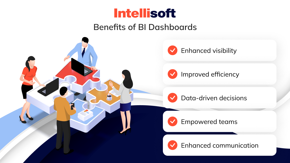
- Enhanced visibility. Business intelligence dashboard tools offer a clear and concise overview of KPIs across your business. This real-time visibility empowers informed decision-making at all levels.
- Improved efficiency. Say goodbye to sifting through mountains of data. BI dashboards automate data analysis and presentation, saving users valuable time and resources. This allows them to focus on strategic initiatives rather than data wrangling.
- Data-driven decisions. BI dashboards transform data from an abstract concept into actionable insights. By visualizing trends and correlations, they guide users toward data-driven decisions that optimize performance and drive business growth.
- Empowered teams. A business intelligence dashboard makes data accessible to different company departments, helping every part of the business understand its impact on the bigger picture. In turn, this approach helps foster collaboration and ensure that every member of the team is working towards the same goal.
- Enhanced communication. A dashboard in business intelligence provides a common language for data visualization. Easy-to-understand visuals facilitate communication across departments, bridging the gap between technical experts and non-technical stakeholders.
Limitations of BI Dashboards
Dashboard business intelligence software is not perfect, unfortunately. They pose certain challenges for BI teams and business users. Let’s take a look at the potential challenges of BI dashboards:
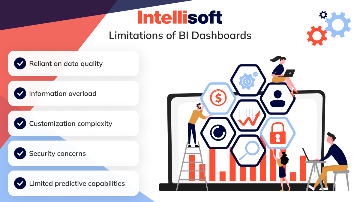
- Reliant on data quality. BI dashboards are only as good as the data they’re fed. Inaccurate or incomplete data will lead to misleading insights. Maintaining data quality is crucial for maximizing the effectiveness of your BI dashboard.
- Information overload. You shouldn’t feed your BI dashboards with all the data there is, no exceptions. Focus on the most critical KPIs to maintain a clear and actionable view.
- Customization complexity. While BI dashboards offer customization, creating a truly effective one can require some technical expertise. Understanding user needs and data visualization best practices is essential.
- Security concerns. BI dashboards often contain sensitive business information, and it should be secured properly. Otherwise, breaches and leaks are inevitable, and no business wants that.
- Limited predictive capabilities. While BI dashboards excel at analyzing historical data and identifying trends, they may lack true predictive analytics. Additional tools might be necessary for advanced forecasting.
Business Intelligence Dashboard Examples and Use Cases
BI dashboards aren’t theoretical concepts; they’re powerful tools used across various departments to gain valuable insights. Let’s explore the best business intelligence dashboard software use cases that showcase the versatility of BI dashboards:
Sales and Marketing Dashboards
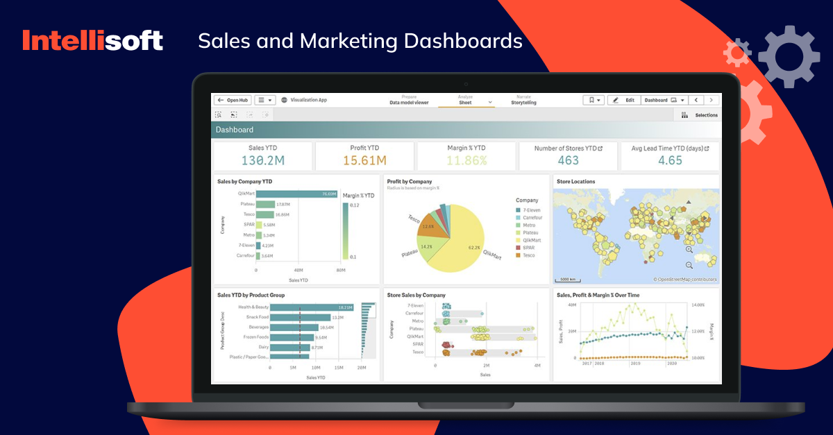
The business intelligence sales dashboard type is used by managers, executives, and sales and marketing teams. It includes data on products or retail sales, sales pipeline progress, lead generation metrics, and marketing campaign performance — all in one place. This empowers sales teams to identify opportunities, prioritize leads, and adjust marketing efforts for maximum ROI.
Customer Dashboards
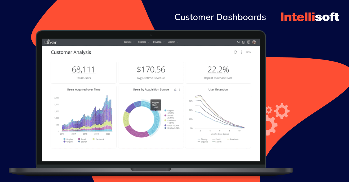
Customer satisfaction is paramount. BI dashboards can track customer engagement metrics, churn rates, and support ticket resolution times. This empowers businesses to identify areas for improvement, personalize customer experiences, and foster long-term loyalty. You can use a business intelligence dashboard for healthcare, education, logistics, commerce, and other sectors where user satisfaction is the number one priority.
Financial Dashboards
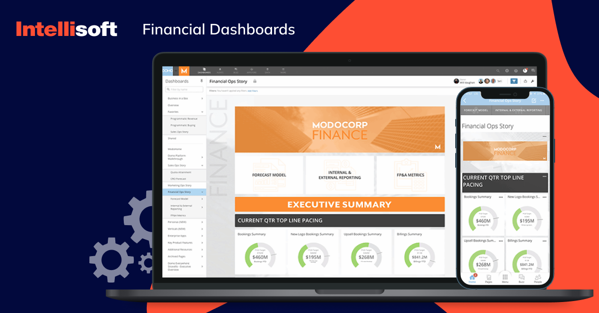
You need a business intelligence dashboard for fintech in USA and other countries to display data on financial KPIs for the chief financial officer and other department managers and employees. BI dashboards act as a financial compass, providing real-time insights into cash flow, revenue streams, and key financial ratios.
Human Resource Dashboards
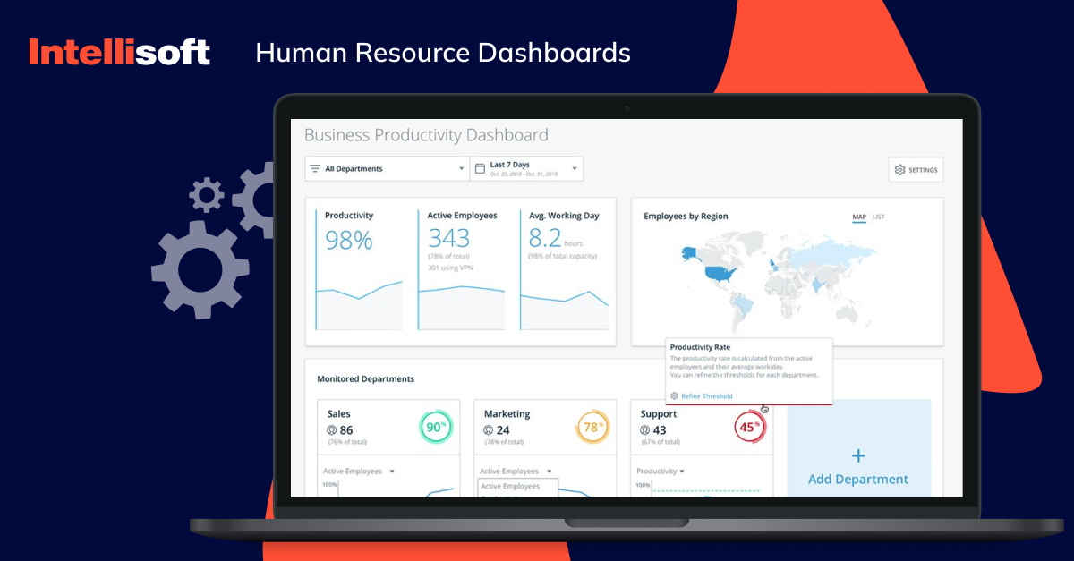
Remember that people are your biggest and greatest asset, and an HR business intelligence dashboard helps unlock the power of data within your workforce. These dashboards help track employee performance metrics, recruitment trends, salary stats, demographics, and the effectiveness of training programs. In this way, your HR team will be able to identify top performers and optimize their recruitment efforts.
Operational Dashboards
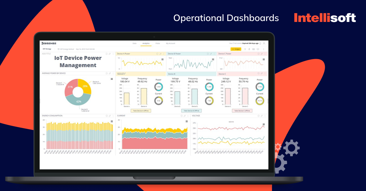
Efficiency is the key to maximizing output. Operational dashboards track production metrics, inventory levels, and supply chain performance in real-time. Managers can leverage this data from the procurement software business intelligence dashboard to identify bottlenecks before they disrupt operations, optimize resource allocation for maximum productivity, and ensure a smooth-running business engine.
IT Dashboards
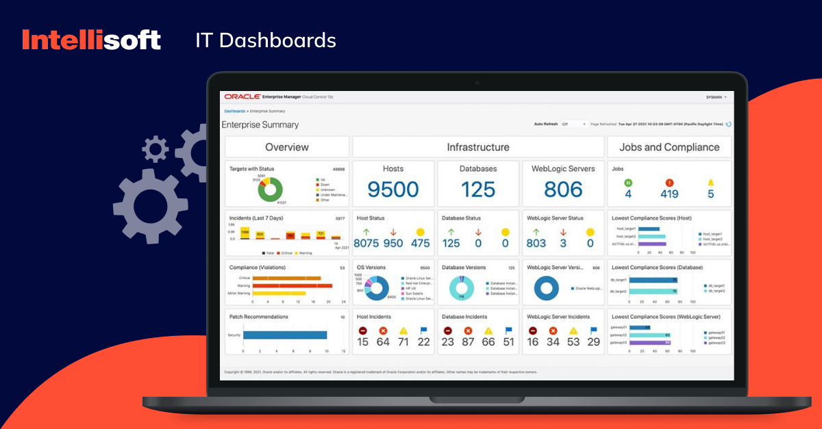
BI dashboards also assist IT teams in tracking metrics such as the use of networks, systems, databases and apps as well as available IT resources. This empowers IT teams to proactively identify and resolve issues before they escalate, ensuring optimal system performance and the security of sensitive data – a critical concern in today’s digital age.
Project Dashboards
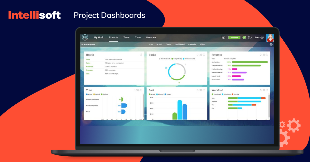
A business intelligence dashboard for healthcare in USA helps you keep track of the status and progress of your business projects and always stay up-to-date with any changes, not missing a any piece of information. The dashboards track project progress, resource allocation, and key deadlines, ensuring everyone is aligned and on track. Project managers can utilize this data to identify risks early on, adjust resource allocation as needed, and celebrate successful project completion.
Mobile Dashboards
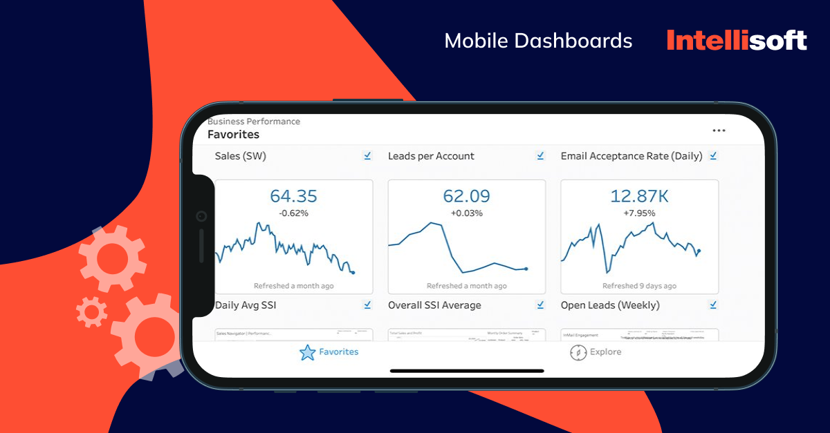
This is not a totally different dashboard category because many are designed for PCs and mobile devices. Mobile BI dashboards provide the power of data on any device, empowering users to stay informed, make data-driven decisions on the go, and react to evolving circumstances with agility. With these dashboards, any visualizations can be easily seen on a small screen.
Related readings:
- Things to Know About Data Processing Agreement (DPA)
- Legal Requirements for Storing Data: Key Insights for Storing User Data
- Making Sense of Databases: How to Choose the Right One
- Big Data Security Intelligence: What You Need to Know
- Machine Learning vs Predictive Analytics: How to Choose
BI Software Examples
So, you’re ready to benefit from the power of BI dashboards, but choosing the right software can feel overwhelming with so many options on the market. Fear not. Here’s a curated selection of popular business intelligence dashboard examples to empower your data journey:
Microsoft Power BI
Functionalities
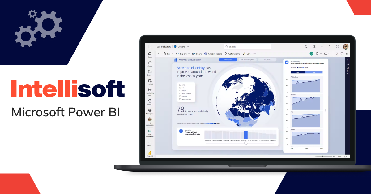
Power BI is one of the best business intelligence dashboard software tools. This BI tool works great with popular office software, making it a breeze to use for familiar teams. It lets you drag and drop things to build dashboards and reports and connects easily to all your data sources. Plus, it offers powerful ways to visualize your data for clear insights.
Pricing
Free tier available. Paid plans start at $9.99 per user/month (Pro) and offer increased storage and collaboration features. Premium Per User (PU) and Premium Capacity (EM) plans offer enterprise-grade features with customized pricing.
Challenges
While user-friendly, Power BI’s free version has limitations on data storage and collaboration features. Upgrading to paid plans unlocks these functionalities but can add to the overall cost. Additionally, complex data models might require some technical expertise to navigate.
Tableau
Functionalities
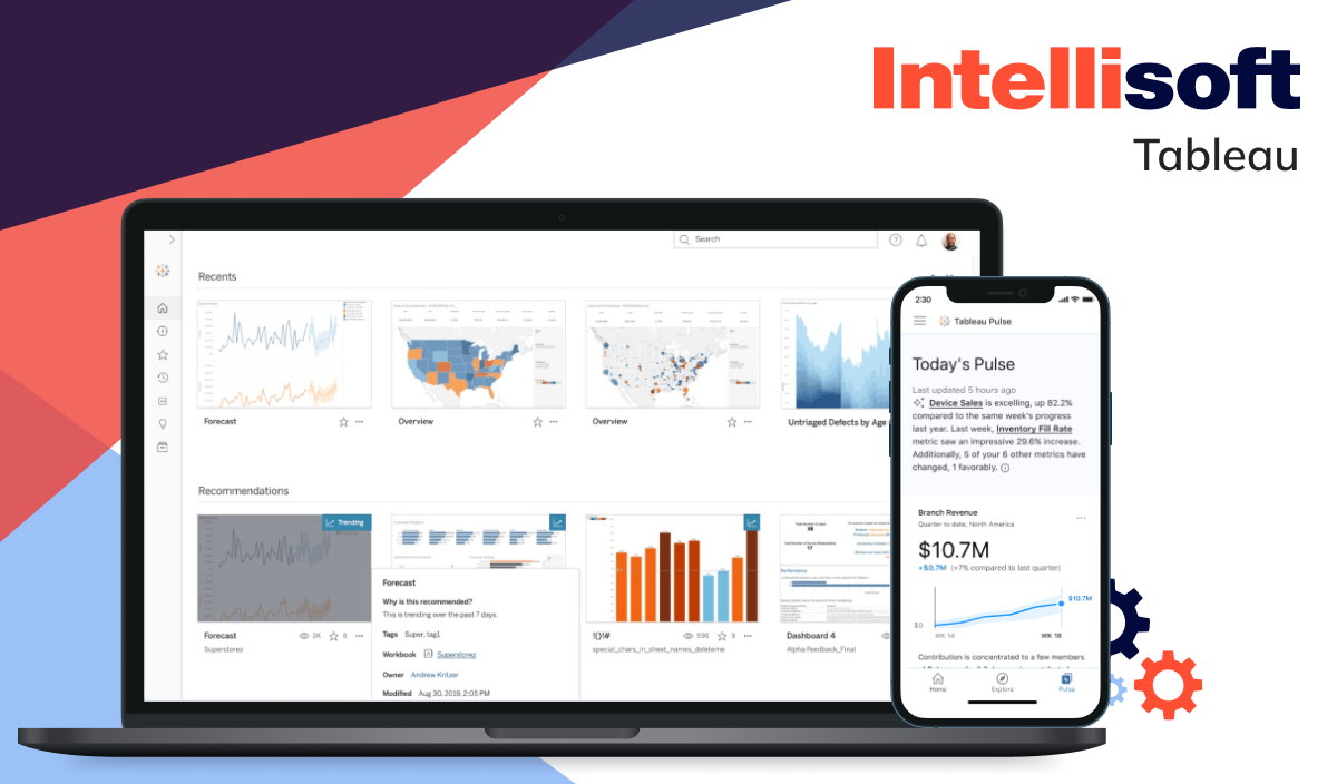
Tableau is known for its advanced data visualization capabilities, offering a wide range of graphs, charts, and other visualizations. It provides unmatched flexibility regarding data sources so users can connect to a wide range of data sources. Moreover, it offers a high level of customization, allowing users to change their reports according to their needs.
Challenges
Tableau’s strength lies in information exploration, but advanced analytics capabilities might require additional tools or integrations. Moreover, Tableau primarily focuses on on-premise deployments, with cloud-based options incurring additional costs.
Pricing
Tableau Viewer costs $15 per user/month. Tableau Explorer costs $42 per user/month, and Tableau Creator is $70 per user/month. Cloud-based options and advanced features require contacting Tableau for a quote.
Sisense
Functionalities
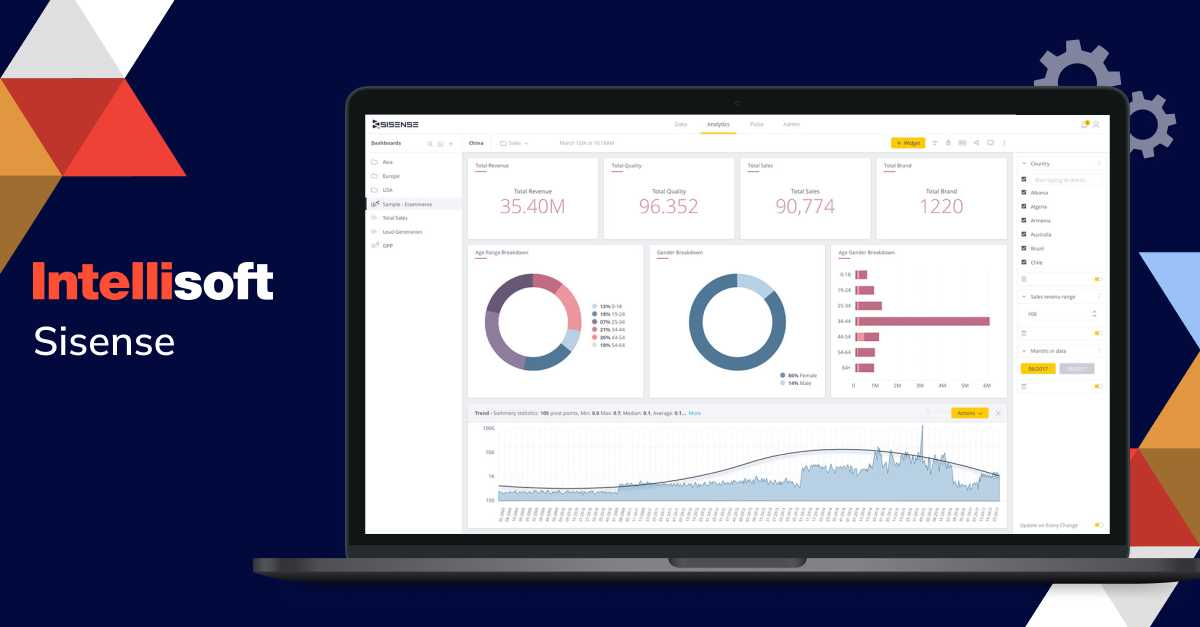
Sisense empowers organizations to transform complex data into actionable insights. Its in-chip technology delivers blazing-fast processing for complex datasets, while ElastiCube technology facilitates rapid querying through a high-performance database. With its drag-and-drop interface and intuitive dashboard creation tools, Sisense caters to users of all technical backgrounds. The ability to embed visualizations directly into applications fosters a data-driven user experience, and robust security features ensure your sensitive information remains protected.
Challenges
Pricing can be complex, scaling based on information volume and user access. Moreover, customization options for visualizations might be less extensive compared to some competitors.
Pricing
Custom pricing based on deployment and user requirements. For more details, contact Sisense.
Google Looker
Functionalities
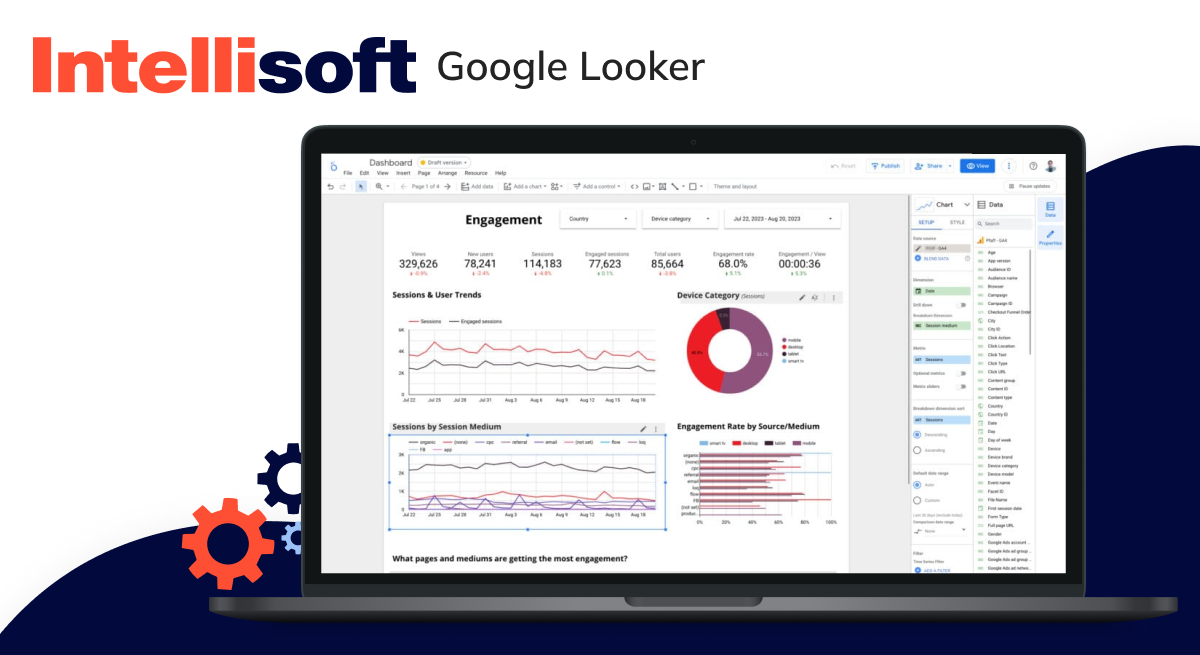
Embrace the power of Google with Looker. This cloud-native platform integrates seamlessly with Google Cloud services, offering a familiar interface for Google users. Looker excels in data governance and security, with robust features to manage user access and data permissions. It also offers advanced analytics capabilities like predictive modeling and machine learning.
Challenges
Looker’s tight integration with Google Cloud might limit its appeal for organizations using other cloud platforms. Its pricing structure can also be complex, with costs potentially scaling based on data volume and user activity.
Pricing
Contact Google for a quote. Pricing is based on data volume, user count, and desired features.
Domo
Functionalities
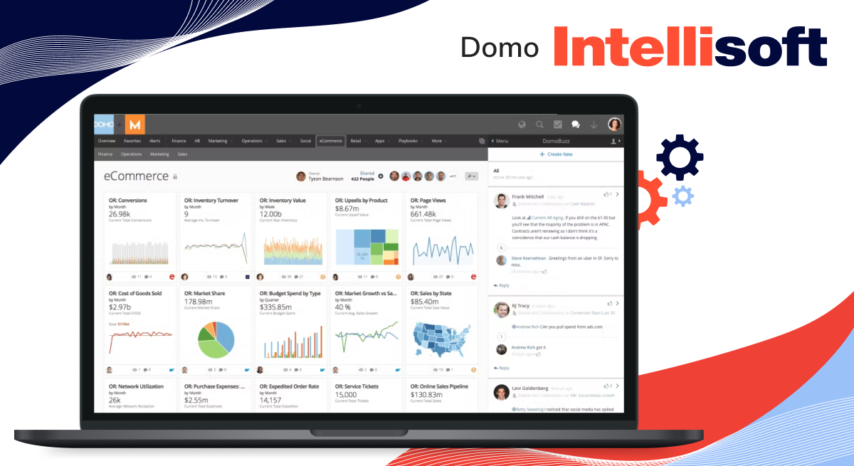
Consolidation is key for Domo. This all-in-one platform goes beyond traditional BI dashboards, offering functionalities for information management, enterprise performance management (EPM), and more. Domo caters to organizations seeking a comprehensive solution to manage their entire data ecosystem. Its user-friendly interface and pre-built connectors simplify data integration from diverse sources.
Challenges
Domo’s comprehensive features come with a price tag. It can be a costly investment for smaller organizations or those solely focused on BI dashboards. Additionally, the sheer number of functionalities might require a dedicated team to manage and maintain the platform effectively.
Pricing
Contact Domo for a quote. Pricing is based on the specific features and functionalities required.
Qlik
Functionalities
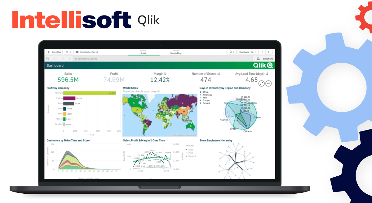
Qlik’s associative engine allows users to navigate and analyze data relationships intuitively. Users can ask questions about the data and explore various dimensions without pre-defined queries. Qlik offers a user-friendly interface and strong information visualization capabilities.
Challenges
Qlik’s associative engine can be powerful, but it might require a steeper learning curve compared to the drag-and-drop functionality some competitors offer. Moreover, Qlik’s on-premise deployment options might require significant IT resources for setup and maintenance.
Pricing
Contact Qlik for a quote. Pricing varies depending on deployment options (on-premise or cloud), data volume, and user count.
Zoho
Functionalities
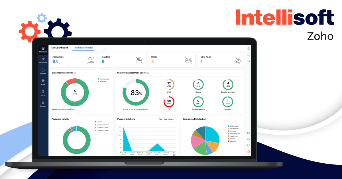
Cost-effectiveness meets functionality with Zoho Analytics. This budget-friendly option offers a suite of BI tools, including dashboards, reporting, and data analysis capabilities. Zoho Analytics integrates seamlessly with other Zoho applications, making it ideal for organizations already invested in the Zoho ecosystem.
Challenges
Zoho Analytics might have limitations in handling very large and complex datasets and its visualization capabilities might be less extensive than some high-end BI platforms.
Pricing
A free tier is available with limited features. Paid plans start at $10 per user/month and offer increased features and storage capacity. Enterprise plans with custom pricing are also available.
IBM Cognos Analytics
Functionalities
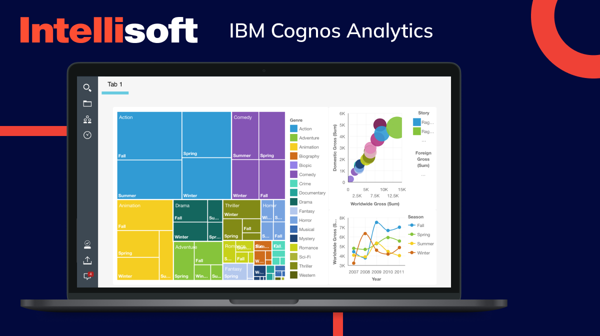
For organizations requiring advanced analytics and AI capabilities, IBM Cognos Analytics is a powerful contender. This enterprise-grade solution offers features like natural language processing, allowing users to ask questions about information in plain English. It also boasts robust data modeling capabilities and integration with other IBM analytics tools.
Challenges
IBM Cognos Analytics is a complex platform requiring significant technical expertise for setup, configuration, and ongoing maintenance. Its pricing reflects its feature-rich nature, making it a solution best suited for larger organizations with substantial information analytics needs.
Pricing
Contact IBM for a quote. Pricing is customized based on specific needs and deployment options.
Business Intelligence Best Practices From IntelliSoft
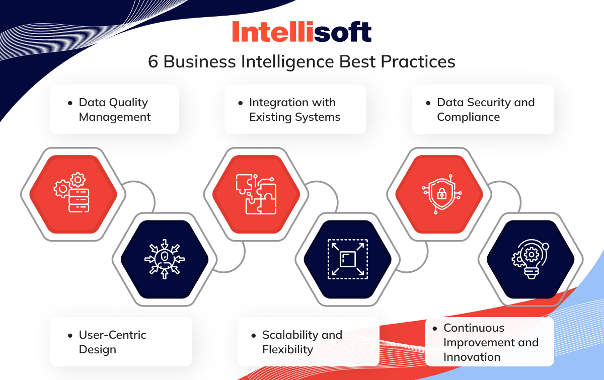
Business intelligence (BI) has the potential to revolutionize your organization, but like any powerful tool, it requires a strong foundation for optimal results. Here, we explore the best practices that act as the pillars of BI success, fostering a data-driven culture that empowers informed decision-making at all levels:
Data Quality Management
You wouldn’t want to build a house on a shaking foundation because you know what it can lead to. Flawed data acts the same way for BI, leading to unreliable insights and, ultimately, poor decisions. Partner with a BI provider with expertise in information quality management. Look for capabilities such as automated and manual data cleansing, standardization, and governance. Duplicate identification, accuracy checks, transformation scripts, and data stewardship programs are all crucial for ensuring end-to-end information accuracy.
User-Centric Design
If your BI tool frustrates users and is challenging to use, it won’t lead to success. When working with a BI partner, make sure that they prioritize user-centric design principles. This involves incorporating quantitative research, iterative prototyping, and role-based customization. Regular user feedback from diverse experience levels is key to refining the business intelligence dashboard design. Your goal should be to follow business intelligence best practices for dashboard design and create intuitive navigation and a user-friendly interface, allowing users to benefit from self-service reporting capabilities and empowering everyone across the organization.
Integration with Existing Systems
Data often resides in various isolated systems across an organization. To gain a holistic view, seamless integration between BI tools and existing systems like CRMs, ERPs, and marketing automation platforms is essential. This breaks down information silos, fostering a centralized information hub that empowers a more comprehensive understanding of your business.
Scalability and Flexibility
As your business evolves, so will your data volume and analytics requirements. Choose a BI solution that scales effortlessly to accommodate increasing data complexity. Ensure the platform offers the flexibility to adapt to future needs, whether integrating new data sources or incorporating advanced analytics capabilities.
Data Security and Compliance
Your information should be properly safeguarded and protected; even the smallest data breach can affect people’s trust. To ensure your information remains secure, prioritize a multi-layered security approach. This includes implementing access restrictions that limit who can view sensitive data. You also need data encryption to safeguard it from unauthorized access and activity audit trails to track all user interactions with the BI system. Beyond these technical measures, fostering a culture of information responsibility is crucial. Granting user permissions based on the principle of least privilege ensures users have only the access level required for their specific tasks.
Continuous Improvement and Innovation
Embrace continuous improvement by regularly evaluating your BI strategy and tools. Stay current with emerging trends, explore new data sources, and invest in ongoing user training. Gather user feedback constantly, embrace agile deployment methodologies, and benchmark against the market. A commitment to innovation ensures that BI remains a powerful driver of growth and success for your organization.
Wrapping Up
Data should empower you, not drown you. You shouldn’t struggle to gain valuable insights – they should emerge effortlessly from the information flood. In other words, you shouldn’t be afraid of big data; it should be your best partner in driving your business forward. With a business intelligence dashboard, this world is within reach.
IntelliSoft, with over 13 years of expertise, can be your guide on this data-driven odyssey as we share our business intelligence dashboard best practices. We craft BI dashboards – not static reports gathering dust – but dynamic visual interfaces that transform your data into a masterpiece of clarity.
Contact IntelliSoft today and unlock the hidden potential within your data!
