Data always tells a story, be it about users, customers, or how the company is performing. But understanding such amounts of information is close to impossible without proper visualization. What is a data visualization? Visualization is the key to quick and easy data presentation and comprehension, and it’s the critical step in information analysis.
Imagine that you have accumulated tons of important information, but you need to present only the most important bits of it to the team, the client, or a stakeholder. You won’t do it manually, in text form; instead, you’ll use charts, data graphics, maps, and other data visualization techniques and tools to help understand the trends and patterns in data.
If you’re ready to learn what is data visualization and take your visualization to the next level, this article is the way to go. Our data analytics experts and designers at IntelliSoft have years of experience in visualization, helping our clients all over the world paint a clear picture of their data. Let’s explore how to do it and how you can benefit from a visual representation of data.
Table of Contents
What Is Data Visualization And Why Is It Important?
Visualization is another way of communication that allows one to share meaning quickly and efficiently. To visualize means to place information into visual formats. Visual communication usually uses typography, signs, illustrations, graphs, and other elements to share meaning. For example, when people see certain numbers in a line graph, they can identify trends and see patterns.
Thus, a data visualization is the representation of information in a visual way.
What is data visualization and why has it become so popular? Visualization became widely used once analytics took over the digital space. By 2025, it’s estimated that 63 exabytes of data – one exabyte being equivalent to one billion gigabytes – will be created every 24 hours worldwide. The more info being created – the higher the need for visualization will be.
Data visualization definition: in short, it is used to help companies make sense of the tons of data they produce. This process is essential for companies to be able to plan and predict on the basis of past info.
For instance, in healthcare, data viz can help improve patient care and treatment, while in finance, it helps assess risks and deal with fraudulent activity. In essence, data visualization is a must for making more informed decisions.
Why do we visualize data? A lot of insights can be gained through a visual representation of data, including:
- Trends. With the help of visualization, you can identify trends in information. On the other hand, these visualizations can pinpoint anomalies, things that deviate significantly from the established trend, prompting further investigation.
- Clusters. Ever wonder who your biggest customers are, or which products people usually buy together? Scatter plots and heatmaps can show you clusters of similar data points, helping you understand connections.
- Proportions. Comparing info has never been easier with visualiation; you can just demonstrate the proportional relationships between values using pie charts or bubble data graphics.
- Range. Visualization goes beyond simply presenting the minimum and maximum values of a variable. It allows you to delve deeper, revealing the entire spectrum of data points. Histograms, for instance, act like a detailed map, with each bar representing the frequency of info points within a specific range. This allows us to not only identify the extremes, but also understand the distribution of information points across the entire spectrum.
- Geography. By plotting location-specific data on maps, you can uncover hidden patterns and geographic clusters that might be invisible in traditional analysis. This unveils spatial relationships within the data, allowing you to identify areas of high concentration, regional trends, and outliers with a geographic component.
Benefits of Data Visualization
Visualization is no longer just a trend to consider or a “nice to have” practice in your company; it’s a must-have, the way to go, and a tool for success and competitiveness. Let’s explore the data visualization definition, its extensive benefits, and how companies all over the globe get the most out of it.
What is data visualization capable of, and what are its advantages?
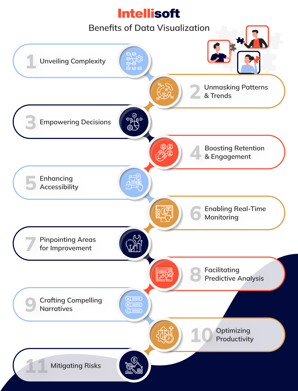
- Unveiling Complexity
Data visualisation is here to transform and simplify huge amounts of information into a visual format, which is easier to comprehend and interpret. Thus, the visual data becomes more digestible and accessible for all groups of people involved. - Unmasking Patterns & Trends
All types of visualization, including graphs, charts, illustrations, and other formats, help reveal trends and patterns in information easier. These trends and correlations might not be visible in the raw info format, but visualization brings everything to light, saving time and resources. - Empowering Decisions
By presenting info in a clear and concise way, visualization empowers informed decision-making. Stakeholders can quickly grasp the situation and make data-driven choices. - Boosting Retention & Engagement
People are more likely to engage with visual data as it is easier to remember and grab attention in the first place. Moreover, if information is visualized in a well-designed, professional, and concise way, it can tell a compelling story without the need to use hundreds of words. Indeed, a picture could be worth a thousand words. - Enhancing Accessibility
Visual representations of data make information accessible to a wider audience, even those without a strong analytical background. Visuals transcend language barriers and communicate insights effectively. - Enabling Real-Time Monitoring
What is dashboard in data visualization? With real-time data dashboards, visualizations allow for continuous monitoring of key metrics. This enables proactive decision-making and course correction as needed. - Pinpointing Areas for Improvement
When you visualize your business info, you can identify possible areas of improvement. For example, you can see that certain departments are not reaching their targets or some products are not performing that well. - Facilitating Predictive Analysis
Visualizations can be powerful tools for predictive analytics. Visualization can inform forecasts and prepare organizations for future scenarios by identifying historical trends and patterns. - Crafting Compelling Narratives
Data science visualization can be used to tell compelling and engaging stories. It is especially useful for convincing stakeholders, training teams, and attracting new customers. - Optimizing Productivity
Once you start gathering insights from visualized info, your teams can work quicker and more effectively, meeting deadlines and avoiding delays. Since there’s no more data confusion or misinterpretation, productivity is better within the business. - Mitigating Risks
Visualization can help mitigate risks and ensure the smooth operation of an organization by identifying trends and potential issues early on.
Five Common Types of Big Data Visualization
Now that you know the data visualization meaning, we can move on to talking about its main types. You can visualize your company’s info in different ways, depending on your goals and the kind of insights you want to gather. Let’s explore the five most common types of data viz and when you can use these data visualization techniques.
Scatterplots
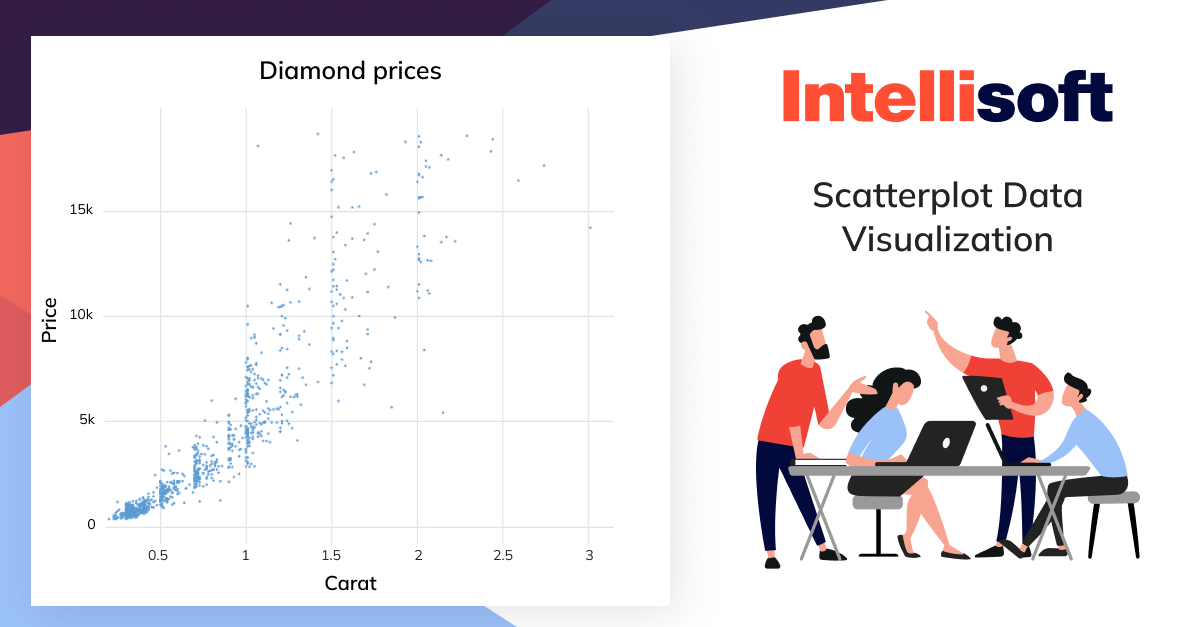
The first data visualizer type is scatterplots. Scatterplots are also known as scatter graphs, and they help visualize the relationship between two variables. The x-axis shows the first variable, and the y-axis shows the other variable. Every data point is depicted as a single point or a “dot” on the graph, creating a scattered effect.
When should you use scatterplots? They are usually used for large datasets when there’s no temporal element. Imagine you want to explore the connection between a person’s height and weight or how a diamond’s carat size affects its value. A scatterplot makes this a breeze.
However, it’s crucial to remember that scatterplots showcase the correlation, not causation, between two variables. Just because data points exhibit a trend doesn’t necessarily mean one caused the other.
Bar Charts
Next in the list of types of data visualizations is a bar chart. Need to visualize categorical data? Opt for bar charts, the champions of categorizing information that falls into different categories rather than numbers.
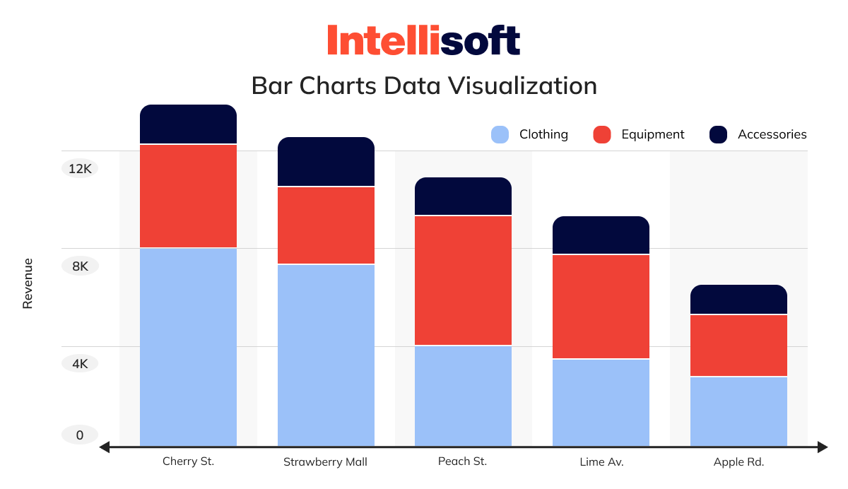
Think of education levels (high school, undergrad, graduate) or age groups (under 30, 30-40, etc.). These categories are discrete, meaning there are no in-betweens – you can’t be halfway through college or partially attend an event. Bar charts are ideal for showcasing things like the number of people in each education level or the number of sales within each age group.
In the bar chart, your categorical information is on the x-axis and plotted against the discrete values on the y-axis.
The bar height is proportional to the values they represent, so it’s easy to visualize and compare the data quickly.
Pie Charts
Just like bar charts, pie charts deal with categorical info. However, the main difference is that pie charts focus on a single variable, showcasing its breakdown into percentages or proportions. Imagine a delicious pie – each slice represents a portion of the whole, and its size directly reflects its contribution.
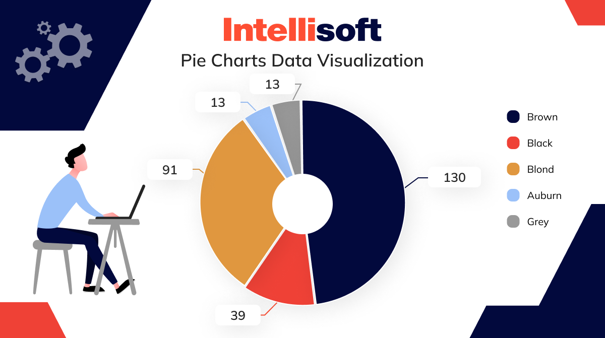
For instance, let’s say you have a class of 30 students and want to visualize their t-shirt colors on a particular day. Possible “slices” could be red, green, blue, and yellow, representing 40%, 30%, 25%, and 5% of the class, respectively. A pie chart would make this clear: the yellow slice (5%) would be a mere sliver compared to the hefty red slice (40%).
However, keep in mind that pie charts are best suited for a maximum of five or six categories. Too many slices make the pie difficult to interpret, defeating the purpose of clear data and information visualization.
Network Graphs
Some info can be easily summarized in a bar or a pie chart, but it’s not the case for all data. Some data is too complex, and should be visualized with the help of network graphs.
These graphs show how different elements within a specific network relate to each other. Each element is a node, and these nodes are connected to each other and related via lines like on the example from the Game of Thrones.
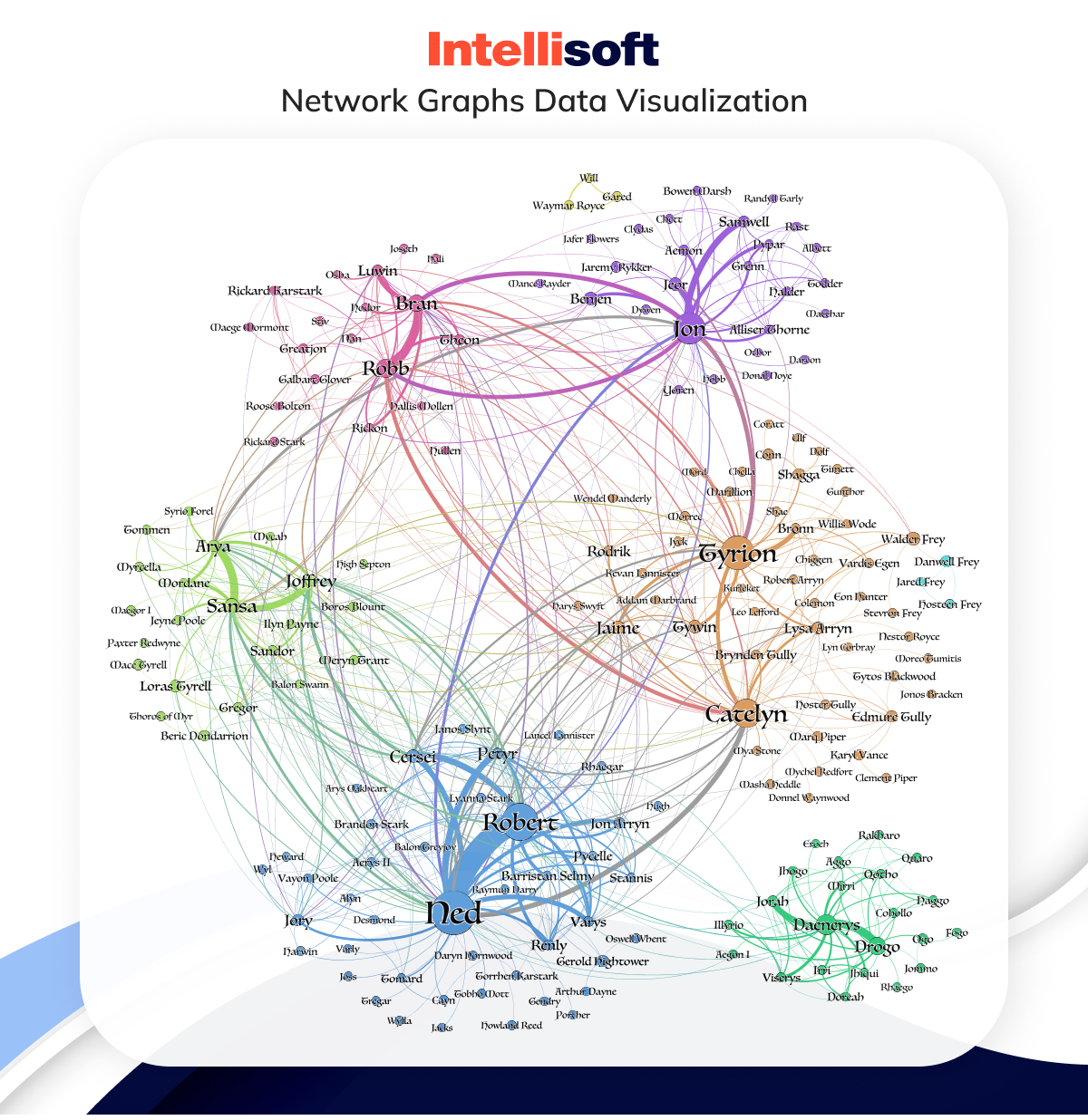
Network graphs excel at revealing hidden connections within vast info networks. Imagine a massive customer database – a network of individuals. Network graphs allow you to visualize connections and similarities between customers or customer groups.
By analyzing these connections, distinct clusters and patterns may emerge, providing a natural way to segment your audience for targeted marketing campaigns.
Geographic Maps
Geographical maps are used to visualize the distribution of specific data in relation to a certain area. For example, color-coded maps are used to shows how different states or cities voted in an election. You can use maps to communicate different types of location-related data.
Related readings:
- Things to Know About Data Processing Agreement (DPA)
- Legal Requirements for Storing Data: Key Insights for Storing User Data
- Making Sense of Databases: How to Choose the Right One
- Big Data Security Intelligence: What You Need to Know
- Machine Learning vs Predictive Analytics: How to Choose
Data Visualization Tools
The times when you had to create visual representations of data manually have passed; these days, there are plenty of tools at your disposal that allow visualize data in a quick and appealing way.
How do you choose a tool, then? First, consider your needs and the type of info you want to be visualized. Another important aspect to consider is your team’s tech expertise; will they be able to do everything by themselves or do you need to train them to use certain visualization tools?
Let’s briefly go through the most popular visualization tools available in the market these days and what type of businesses can benefit from them.
Plotly
- Open-source data visualizer with versions available for enterprises
- Used by data scientists and data analysts
- Highly customizable visuals and lots of tools available
- Requires coding knowledge
Plotly has created tons of data visualizations libraries using Python. The products include Dash, Chart, and others, all of which are open-source and highly customizable.
Since Plotly is Python-based, its libraries are easy to integrate with other Python libraries and applications, especially if your team is proficient in Python.
Using APIs, you can create web apps without the need to be proficient in CSS, JavaScript, or HTML. Even if you struggle with Plotly, there are tons of tutorials available online, and you can ask for help in its vast community.
D3.js
- Open-source software data visualizer tool
- Used by data scientists and data analysts
- Highly customizable with rich visualizations, has a large support community
- More difficult to learn and is not suitable for data cleaning and analysis
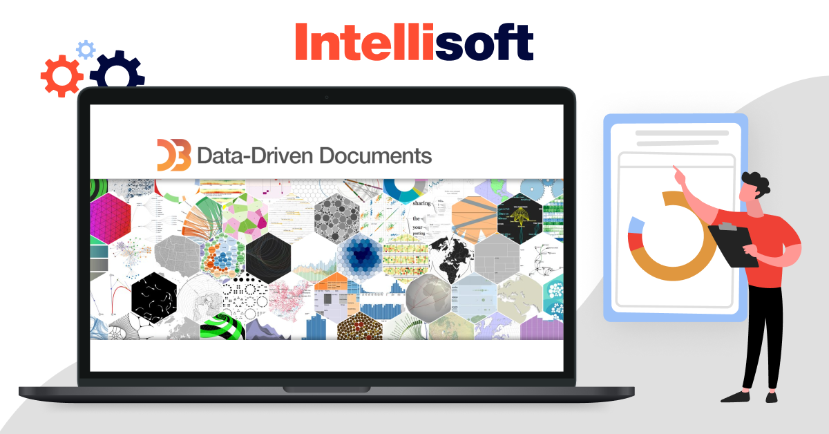
D3.js (Data-Driven Documents) is an open-source JavaScript library that empowers users to create interactive data visualizations for the web. What is interactive data visualization? Those are visualizations that easy to change and use.
Similar to Plotly, it requires coding knowledge but offers a wealth of customization options. D3.js leverages web standards like SVG, HTML5, and CSS, ensuring broad browser compatibility for your visualizations.
Qlik Sense
- Open-source
- Used by data scientists and analysts
- Large support community
- Highly customizable
- Steep learning curve
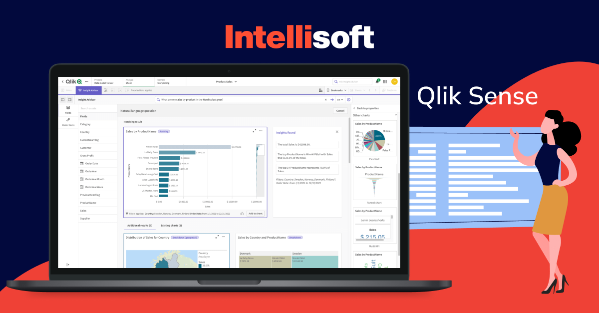
Qlik Sense goes beyond the data visual part. It’s a business intelligence (BI) tool designed to empower users with real-time, custom dashboards that offer both deep analytics and clear visualizations. Imagine interactive pie charts, tables, and graphs that update with the latest data, providing a constantly evolving picture of your business performance.
One of Qlik Sense’s strengths is its tight integration with other tools within the Qlik ecosystem. This allows for a more comprehensive and unified approach to data analysis compared to some standalone visualization tools. While Qlik Sense caters more to developers, offering greater flexibility and control, it doesn’t lock out non-technical users entirely.
A true standout feature is the ETL (Extract, Transform, Load) script editor. This powerful tool makes pulling data from a vast array of sources a breeze. Relational databases, spreadsheets, text files, web services, and even CRM apps like SAP or Salesforce can all be seamlessly integrated.
Tableau
- There are two versions: Desktop for the enterprise, and Public is open-source but with a limited functionality
- Used by BI analysts and data analysts
- Interactive, with excellent usability and great visualizations
- No data pre-processing, poor customization of functions
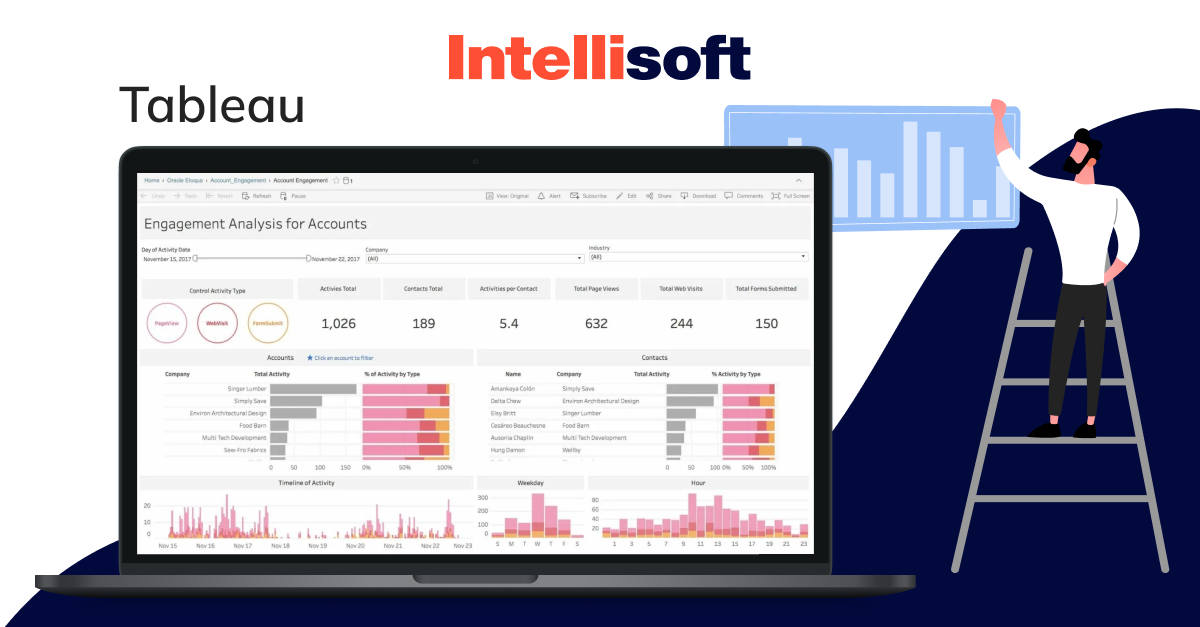
Tableau stands out as a user-friendly analytics data visualization tool that doesn’t compromise on functionality. Unlike some commercial products, Tableau offers a robust selection of interactive visualizations and the ability to handle large datasets effectively. This makes it a valuable tool for tasks beyond creating basic charts – it allows users to translate complex data into clear and insightful visuals.
The key to Tableau’s success lies in its intuitive drag-and-drop interface. This ease of use does come with a trade-off: in-depth tasks like exploratory analysis might be better suited for other tools. However, Tableau retains enough features to empower analysts. They can create informative dashboards for non-technical audiences while maintaining the integrity of their analysis.
One of the main limitations of this tool is that it’s not designed for tasks like machine learning or data pre-processing. There’s also a lack of scripting layers that restricts customization for highly specific workflows.
Examples of Data Visualization
Data visualisations play a crucial role in translating complex data sets into comprehensible insights across various industries. Here’s how is data visualization used in different sectors to enhance decision-making and operational efficiency.
Healthcare
- Patient Care. Data visual interactive dashboards become the eyes and ears of medical professionals, displaying vital signs and treatment progress over time. This allows for swift identification of critical changes in a patient’s condition.
- Disease Tracking. Take the COVID-19 pandemic as a prime example. Real-time data visualizations, like the Johns Hopkins COVID-19 tracker, provided invaluable insights into global infection rates, recovery trajectories, and vaccination progress.
- Resource Management. Hospitals leverage visualization tools to optimize bed occupancy, staff allocation, and medical supply inventory. These clear visuals ensure efficient resource utilization, allowing healthcare providers to focus on patient well-being.
Logistics
- Route Optimization. Gone are the days of guesswork in logistics. Data visualization tools map the most efficient delivery routes, factoring in traffic patterns, weather conditions, and road closures. This translates to reduced transit times and cost savings.
- Supply Chain Transparency. Real-time dashboards become a window into the supply chain ecosystem. Inventory levels, shipment status, and warehouse operations are all readily visible, allowing for better demand forecasting and seamless coordination across the entire chain.
- Performance Monitoring. Companies like FedEx and UPS rely on analytics data visualization to keep a pulse on key performance indicators (KPIs) such as delivery times, fleet efficiency, and customer satisfaction. These insights guide strategic decision-making and continuous improvement within the logistics network.
Insurance
- Risk Assessment. Insurers use heat maps and scatter plots to identify high-risk areas for natural disasters, which aids in setting premiums and coverage limits.
- Fraud Detection. Anomaly detection dashboards highlight suspicious claims patterns, enabling faster investigation and prevention of fraudulent activities.
- Customer Analysis. Visualization tools help insurers understand customer demographics, policy uptake trends, and claim histories, allowing for more tailored marketing strategies and product offerings.
E-commerce
- Sales Analysis. Interactive sales dashboards provide insights into sales performance by product, region, and time period, helping businesses identify trends and adjust strategies.
- Customer Behavior. Heat maps and funnel analysis visualize customer journeys on the website, revealing drop-off points and areas for improvement in the user interface.
- Inventory Management. Visualization tools track stock levels in real-time, predict demand trends, and alert managers about low inventory or overstock situations, ensuring efficient inventory management.
Education
- Student Performance. Data visualization architecture empowers educators to track student performance effectively. Grades, attendance, and participation metrics displayed on dashboards help identify students who might need additional support, allowing for early intervention and improved learning outcomes.
- Resource Allocation. Visualization tools streamline classroom management by assisting with assignments, scheduling, and the allocation of educational resources such as textbooks and technology. This ensures resources are effectively distributed, fostering a better learning environment for all.
- Learning Analytics. Visualizations of assessment results and learning activities provide valuable insights into the effectiveness of teaching methods and curriculum design. This knowledge empowers educators to continuously improve their approach and create engaging learning experiences for students.
Data Visualization Best Practices
When you’re about to create information visualization, you should be aware of some of the best practices that will help you make the process more effective. Let’s explore.
Choosing the Right Data Visualization for Your Data
Different info types call for different visualizations. Bar charts excel at comparing categories, while line graphs showcase trends over time. Pie charts are best suited for proportions of a whole, while scatter plots reveal relationships between variables. Thus, consider the type of data first, and then choose the right information visualization wisely.
Know Your Audience
Understanding who will be viewing your visualization is essential for tailoring it to their needs and expectations. Consider their level of expertise, familiarity with the information, and what they need to extract from the visualization. A dashboard designed for executives might prioritize high-level insights and trends, while one for analysts would include more granular details and interactive elements for deeper exploration.
Utilizing Visualization Libraries
Using robust data illustration libraries and tools can enhance the quality and functionality of your visualizations. Libraries like D3.js, Chart.js, and Plotly offer extensive customization options and capabilities for creating interactive, dynamic charts. These tools help you implement best practices more efficiently and provide a professional appearance to your visualizations.
Harness the Power of Visual Perception
Color, size, and shape can be powerful tools in your analytics data visualization arsenal. Use color strategically to represent different info points or categories. For instance, green might represent positive trends, while red highlights negative values. Similarly, the size and shape of elements can be varied to visually emphasize important information. Remember accessibility – choose color combinations that are considerate of color blindness.
Being Mindful of Text Labels and Tooltips
Don’t let your visualizations become cryptic puzzles. Ensure clear and concise text labels for axes, data points, and chart elements. Supplement this with informative tooltips that appear when hovering over specific info points, providing additional context and details.
Avoiding Misleading or Inaccurate Visualizations
Data illustration is all about honest representation. Refrain from using distorted scales, misleading chart types, or manipulating colors to create a false narrative. Remember, your goal is to illuminate insights, not manipulate them.
Testing Your Visualizations to Ensure They Are Effective
Testing is an invaluable step in the information visualization process. Share your visualizations with a representative audience and gather feedback. Are they clear? Do they effectively communicate your message? Refine your charts based on their insights to ensure they resonate and drive understanding.
Wrapping Up
Meet info visualization – a true transformative force that helps businesses bridge the gap between raw data and actionable insights. With visualization, you’ll be able to simplify data interpretations, trends prediction, and revealing patterns and correlations in information.
However, navigating the world of visualization can be complex. From choosing the right chart type to ensuring accessibility and clarity, there are many factors to consider.
This is where IntelliSoft comes in. Our team of visualization experts possesses the knowledge and experience to guide you through every step of the process. We can help you select the most effective visualizations for your data, design impactful charts, and ensure your message resonates with your audience.
Ready to unlock the power of data visualisations and transform your business decisions? Contact IntelliSoft today for a free consultation. Let’s turn your information into a compelling story that drives success.
